Daffodil
#FFFF31
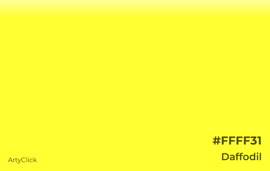
What color is Daffodil
Daffodil is a light bright shade of Yellow. It belongs to the color family Yellow, and it has high lightness and high saturation. Daffodil is a warm color.
What are the HEX, RGB, HSV, HSL and CMYK color codes of Daffodil
RGB space
CMYK space
The hex code for Daffodil is #FFFF31.
In the RGB (Red, Green, Blue) color space, which is used for digital colors, Daffodil has 100%% Red, 100% Green, and 19% Blue.
Daffodil has 60° Hue, 81% Saturation, and 100% Value in the HSV (Hue, Saturation, Value) color space, which is another way to represent digital colors.
Daffodil has 60° Hue, 100% Saturation, and 60% Lightness in the HSL (Hue, Saturation, Lightness) color space, which is a different way to express digital colors.
Daffodil has 0% cyan, 0% magenta, 81% yellow, and 0% black in the CMYK (Cyan, Magenta, Yellow, Black) color space, which is used for color printing.
Color Space |
Original Units |
Percentage |
|---|---|---|
Hex |
#FFFF31 |
|
RGB |
(255, 255, 49) |
(100%, 100%, 19%) |
HSV |
(60°, 81, 100) |
(17%, 81%, 100%) |
HSL |
(60°, 100, 60) |
(17%, 100%, 60%) |
CMYK |
(0, 0, 81, 0) |
(0%, 0%, 81%, 0%) |
How does Daffodil contrast with black and white
The natural luminance of Daffodil is 93%, which is high.
Daffodil has a higher contrast with black than white.
Daffodil and black have a 19.6:1 contrast ratio, which meets the AAA requirement. These colors are suitable for text.
Daffodil and white have a 1.1:1 contrast ratio, which is insufficient for readability.
Luminance |
Contrast to Black |
Contrast to White |
|---|---|---|
93% |
AAA (19.6) |
insufficient (1.1) |
Example Black |
Example White |
Example Black |
Example White |
What colors go with Daffodil
How to mix Daffodil paint
To mix Daffodil paint using eight primary colors (Red, Green, Blue, Cyan, Magenta, Yellow, White, and Black), you'll need to combine 81% Yellow, 19% White, as shown below.

Yellow
81%
Red
0%
Green
0%
Blue
0%
Cyan
0%
Magenta
0%
Black
0%
White
19%
To mix Daffodil paint using five primary colors (Cyan, Magenta, Yellow, White, and Black), you'll need to combine 81% Yellow, 19% White, as shown below.
Cyan
0%
Magenta
0%
Yellow
81%
Black
0%
White
19%
What colors are similar to Daffodil
Colors similar to Daffodil are: Canary Yellow, Golden Fizz, Sunny Yellow, ArtyClick Yellow, and Cadmium Yellow. Canary Yellow is paler than Daffodil. Golden Fizz is paler and darker than Daffodil. Sunny Yellow is brighter and darker than Daffodil. ArtyClick Yellow is brighter than Daffodil. Cadmium Yellow is brighter and darker than Daffodil.