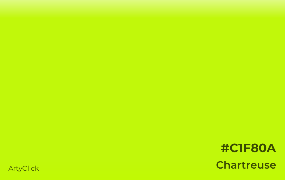
Chartreuse
#C1F80A
Shades of Chartreuse
What color is Chartreuse
Chartreuse is a light bright shade of Yellow. It belongs to the color family Yellow, and it has high lightness and high saturation. Chartreuse is a warm color.
What are the HEX, RGB, HSV, HSL and CMYK color codes of Chartreuse
RGB space
CMYK space
The hex code for Chartreuse is #C1F80A.
In the RGB (Red, Green, Blue) color space, which is used for digital colors, Chartreuse has 76%% Red, 97% Green, and 4% Blue.
Chartreuse has 74° Hue, 96% Saturation, and 97% Value in the HSV (Hue, Saturation, Value) color space, which is another way to represent digital colors.
Chartreuse has 74° Hue, 95% Saturation, and 51% Lightness in the HSL (Hue, Saturation, Lightness) color space, which is a different way to express digital colors.
Chartreuse has 22% cyan, 0% magenta, 96% yellow, and 3% black in the CMYK (Cyan, Magenta, Yellow, Black) color space, which is used for color printing.
Color Space |
Original Units |
Percentage |
|---|---|---|
Hex |
#C1F80A |
|
RGB |
(193, 248, 10) |
(76%, 97%, 4%) |
HSV |
(74°, 96, 97) |
(21%, 96%, 97%) |
HSL |
(74°, 95, 51) |
(21%, 95%, 51%) |
CMYK |
(22, 0, 96, 3) |
(22%, 0%, 96%, 3%) |
How does Chartreuse contrast with black and white
The natural luminance of Chartreuse is 78%, which is high.
Chartreuse has a higher contrast with black than white.
Chartreuse and black have a 16.7:1 contrast ratio, which meets the AAA requirement. These colors are suitable for text.
Chartreuse and white have a 1.3:1 contrast ratio, which is insufficient for readability.
Luminance |
Contrast to Black |
Contrast to White |
|---|---|---|
78% |
AAA (16.7) |
insufficient (1.3) |
Example Black |
Example White |
Example Black |
Example White |
What colors go with Chartreuse
How to mix Chartreuse paint
To mix Chartreuse paint using eight primary colors (Red, Green, Blue, Cyan, Magenta, Yellow, White, and Black), you'll need to combine 58% Yellow, 35% Green, 3% Black, 4% White, as shown below.

Yellow
58%
Red
0%
Green
35%
Blue
0%
Cyan
0%
Magenta
0%
Black
3%
White
4%
To mix Chartreuse paint using five primary colors (Cyan, Magenta, Yellow, White, and Black), you'll need to combine 18% Cyan, 76% Yellow, 3% Black, 4% White, as shown below.
Cyan
18%
Magenta
0%
Yellow
76%
Black
3%
White
4%
What colors are similar to Chartreuse
Colors similar to Chartreuse are: Lemon Green, Bright Yellow Green, Greenish Yellow, ArtyClick Lime, and Acid Green. Lemon Green is more green and brighter and darker than Chartreuse. Bright Yellow Green is more green and brighter than Chartreuse. Greenish Yellow is more yellow and brighter and lighter than Chartreuse. ArtyClick Lime is brighter and lighter than Chartreuse. Acid Green is more green than Chartreuse.