Color Shades Finder
Color Shades and Tints Finder
Adjust Color
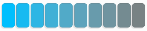
Lightness
Saturation
Temperature
Lower
Higher
Lower
Higher
Cooler
Warmer
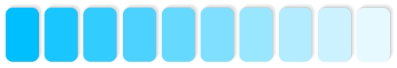
Color Tints
#
#
#
#
#
#
#
#
#
#
Color Shades
#
#
#
#
#
#
#
#
#
#
Color Composition
System |
Original Units |
Percents |
|---|---|---|
RGB |
||
HSL |
||
HSV |
||
CMYK |
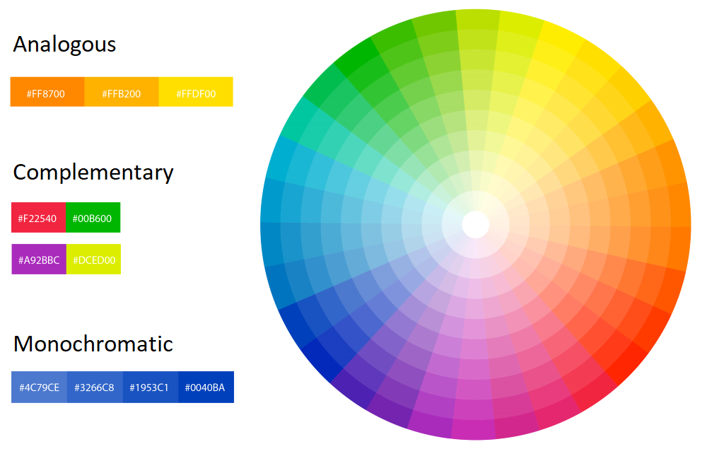
Related Colors
Complementary
Analogous Warm
Analogous Cool
Sample Color Palettes
Warm Palette
#
#
#
#
#
Cool Palette
#
#
#
#
#
Spring Palette
#
#
#
#
#
Analogous Palette
#
#
#
#
#
Similar Tools
Similar Quizes
ArtyClick "Color Shades and Tints Finder"
Getting Started with a Color
To select a color:
Enter a HEX code in the
 search bar (e.g. #FF0000 or #FF0), or
Enter an RGB code in the
search bar (e.g. RGB(255,0,0)), orUse the color picker by clicking on the
 color wheel to select a color
Color Overview
Fields describing the selected color:
Color hex code (e.g. "#00BFFF")
Color name from the ArtyClick Color Dictionary (e.g. Sky Blue)
Color name match score (between 0% and 100%)
Color hue: the respective color in its full saturation and brightness
Control Panel for Fine-Tuning a Color
Sliders used to adjust a color:
Lightness: low (adding black) to high (adding white)
Saturation: low (adding grey) to high (reducing grey)
Temperature: cool (adding blue) to warm (adding yellow or red)
Color Composition
RGB: an additive (digital) color model in which Red, Green, and Blue lights are added together to reproduce colors
HSL: an alternative additive cylindrical-coordinate representation of the RGB color model using Hue, Saturation, and Lightness
HSV: an alternative additive cylindrical-coordinate representation of the RGB color model using Hue, Saturation, and Value
CMYK: a subtractive (process) color model used in color printing (Cyan, Magenta, Yellow, and Key - black)
Color Combinations
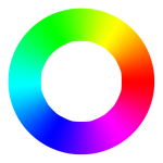
Color theory is the study of how colors can be combined to create different effects and moods. One of the basic tools of color theory is the color wheel, which shows the relationships between the primary, secondary, and tertiary colors. The color wheel can help us find colors that are analogous (similar), complementary (contrasting), or monochromatic (same hue but different lightness or saturation). These are some of the common types of color schemes that can create harmony and balance in a design. However, there are other factors that can influence how we perceive colors, such as color temperature and luminance. Color temperature refers to how warm or cool a color is, and it can affect the mood and atmosphere of a design. Luminance is the amount of light that a color reflects or emits, and it can affect the contrast and visibility of a design. By considering these aspects, we can create more effective and appealing color combinations.
The Summer color palette is based on the idea of capturing the warm and bright colors of the summer season. It includes at least one warm color, such as red, orange, or yellow, to evoke a sense of heat and energy. The other colors can be neutral or cool, but they should complement the warm color and create a harmonious balance.
The Winter color palette is inspired by the cold and dark colors of the winter season. It includes at least one cool color, such as blue, purple, or green, to convey a feeling of calmness and elegance. The other colors can be neutral or warm, but they should contrast with the cool color and create a dynamic effect.
The Spring color palette is influenced by the fresh and lively colors of the spring season. It includes at least one green color, such as lime, mint, or olive, to represent the growth and renewal of nature. The other colors can be neutral or any other hue, but they should match the green color and create a cheerful mood.
The Analogous color palette is created by using colors that are adjacent to each other on the color wheel. This means that they have similar hues and values, and they blend well together. For example, an Analogous color palette could consist of red-orange, orange, and yellow-orange, or blue-green, green, and yellow-green.
Color Shades, Tints and Tones
Finding Color Shades (Low Lightness)
A color shade is achieved by mixing a color with black, which increases the color darkness. While it decreases the color luminance, it also decreases its saturation.

Tip: for cool colors, to decrease a color's luminance without compromising on the color saturation, try to add blue (#0000FF) instead of black (shifting color temperature towards blue).
Finding Color Tints (High Lightness)
A color tint is achieved by mixing a color with white, which reduces the color darkness. While it increases the color luminance, it also decreases its saturation.
Tip: for warm colors, to increase a color's luminance without compromising on the color saturation, try to add yellow (#FFFF00) instead of white (shifting color temperature towards yellow).
Finding Color Tones (Saturation)
The color tone is produced by mixing a color with grey. Since grey is a combination of white and black, it is equivalent to applying both tinting and shading simultaneously.
Tip: color tones serve best as background colors as they are neutral and don't distract from the main elements, which are usually in brighter, more saturated colors.
Adjusting Color Temperature
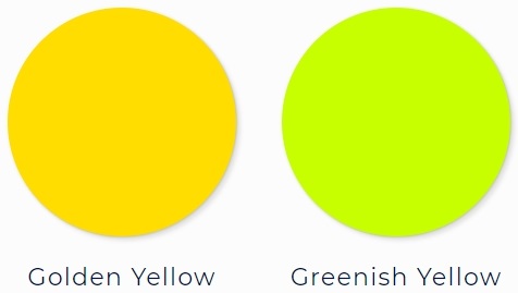
One way to classify colors is by their temperature: warm or cool. Warm colors are those that have yellow, orange, or red hues, while cool colors are those that have blue hues. However, color temperature is not absolute, but rather relative. This means that any color can be warmer or cooler depending on its hue. For example, a yellow that leans towards orange (such as golden yellow) is warmer than a yellow that leans towards blue (such as greenish yellow). The same principle applies to other colors. For instance, a purple that has more blue in it is cooler than a purple that has more red in it.
Color temperature refers to the perceived warmth or coolness of a color, and it has a significant impact on how we perceive and react to different colors. Warm colors, such as red, orange, and yellow, tend to evoke feelings of warmth, comfort, and passion, while cool colors, such as blue, green, and purple, tend to create a sense of calmness, professionalism, and detachment. This is why many industries use color temperature strategically in their branding and marketing. For example, many food-related businesses use warm colors in their logos and packaging, as they stimulate our emotions (including our appetite) and make us feel more welcome and satisfied. On the other hand, many corporate and financial businesses use cool colors in their logos and websites, as they communicate a sense of trustworthiness, reliability, and logic.