Color Palette From Image
Color Palette From Image
Similar Tools
ArtyClick Color Palette Generator from Image
In nature, we often encounter colors that are harmonious and pleasing to our eyes. The natural light in photographs also creates a sense of coherence and balance among the colors. Therefore, the color palettes that are derived from images tend to have a balanced and appealing look. This is how image-based color palette generators can help us create beautiful and meaningful designs.
Steps
Generating color palettes from images is simple with ArtyClick:
Use the
 button
to select and load your image
button
to select and load your imageDrag and drop color swatches to reorder colors in the palette
Use the
 button
to update a color swatch using color picker (click "Enter" to update)
button
to update a color swatch using color picker (click "Enter" to update)Use the
 button
to delete a color swatch
button
to delete a color swatchUse the
 button
to download the displayed image with your refined color palette
button
to download the displayed image with your refined color paletteUse the
 button
to save the color palette to your account
button
to save the color palette to your account
How To Create a Balanced Color Palette From an Image
Colors have the power to evoke associations, especially when they are combined in a way that reflects the unique landscapes of our world. This is the reason why many people enjoy using color palette generators from images: they capture the essence of the original images and elicit emotions that are similar to those we experience when we see the images in person.
Planning for a Color Palette
Before generating a color palette suited for a particular purpose or audience, one may consider the following aspects:
Theme (background color): light or dark colors
Character: soft pastel or bright colors
Impact: analogous (similar) or complementary (contrasting) colors
Audience: target group-specific preferences
Complexity: the number of colors
Accessibility: the contrast between the text and background colors
Refining a Color Palette
Creating and presenting a color palette can be a challenging task, as there are many factors to consider, such as harmony, contrast, mood, and readability. However, there are some general guidelines that can help you design and display a color palette with more impact and appeal. Here are some of them:
Place analogous color swatches next to each other, to create a sense of harmony and cohesion in your palette.
Arrange the colors in your palette according to their brightness and saturation, which are measures of how light or dark and how intense or dull a color is. A good rule of thumb is to place the darkest colors on the outer edges and the lightest colors in the center of your palette. This creates a balanced and pleasing visual effect.
Add accent colors, which are colors that stand out from the rest of the palette, next to pale colors, to create contrast and interest. Accent colors can be bright, vivid, or complementary colors, which are colors that are opposite to each other on the color wheel.
Simplify your palette by removing any colors that are too similar or redundant. Having too many colors in your palette can make it look cluttered and confusing.
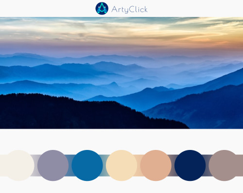
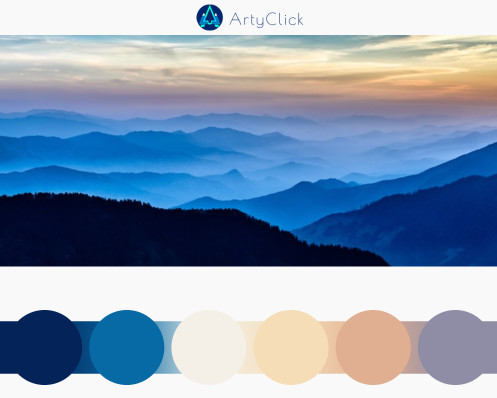
The image below shows an example of how these guidelines can improve the presentation of a color palette. The first image shows the original palette, which has many colors, lacks contrast and harmony, and looks rather flat. The second image shows the improved palette, which has fewer colors, more contrast and harmony, and looks more vibrant.