HTML Button Style
HTML Button Style
Shape
Padding ↔
Padding ↕
Border Radius ⤡
Border Radius ⤢
Border
Thickness
Line Type
Shadow ⤡
Shadow ⤢
Colors
Gradient
Gradient Direction
Background
Font
Size
Weight
Stretch
Templates
Similar Tools
ArtyClick "HTML Button Styler"
Styling a HTML Button: Shape
The following options are available to set the shape of a web button:
Padding horizontal (left and right)
Padding vertical (top and bottom)
Border radius top left and bottom right corners
Border radius top right and bottom left corners
Styling a HTML Button: Border
The following options are available to set the border of a web button:
Border thickness
Border line style (solid, double line, dotted, dashed)
Shadow top left and bottom right corners
Shadow top right and bottom left corners
To set the shadow to none, move the respective sliders to the middle.
Styling a HTML Button: Colors
The following options are available to set the colors of a web button:
Button, first color: the color of the button
Button, second color: the second color of the button for a gradient
Button, third color: the color of the button on hover
Button, gradient direction (where applicable)
Font and border color
Background (body) color
When the first button color is updated, the second and the third button colors are also reset. The third color (for the hover option) is updated automatically, depending on the selected first button color.
If the second button color differs from the first, a gradient is applied.
The font and button border colors are set to the same color by default.
Styling a HTML Button: Font
The following options are available to set the font of a web button:
Font size
Font weight
Font stretch (letter spacing)
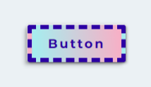
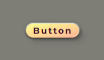
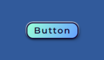
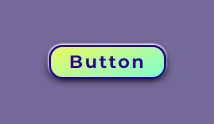
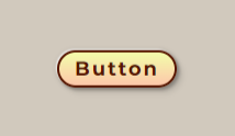
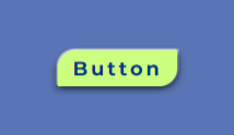
The below examples show design ideas for HTML buttons with a gradient background.
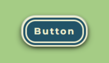
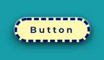
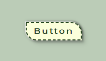
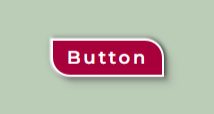
The following four examples show design ideas for HTML buttons with an asymmetric shape.
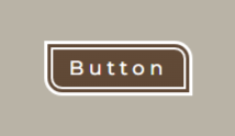
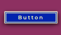
The below examples show design ideas for bold HTML buttons.